The Market Isn't Short On Supply —
It's Sensitive to Behavior
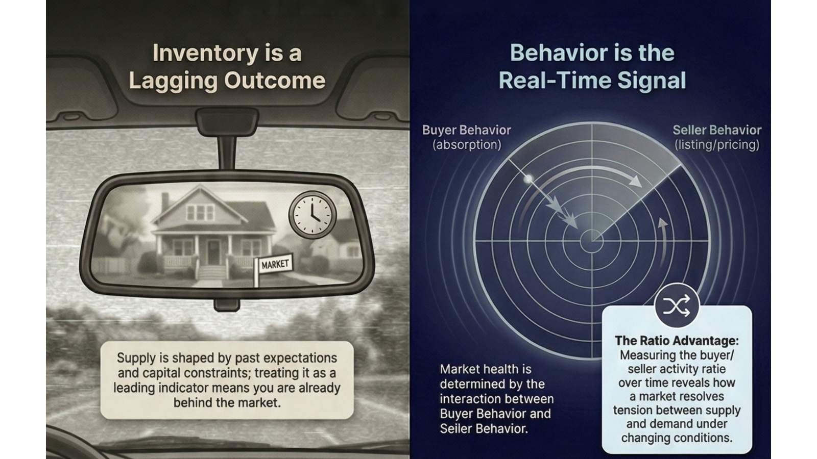
The core premise of the Acre X Market Behavior Analysis: inventory reflects the past. Behavior reveals what's happening now.
The market isn't short on supply. It's sensitive to behavior. More specifically, it's sensitive to the interaction between buyer demand and seller activity — and to how that interaction is measured. Residential data captures that interaction faster and more granularly than most commercial metrics. That makes it a signal worth understanding — not as a residential story, but as a behavioral one with direct commercial implications.
That second part matters more than most people realize. The same market can look like a seller's market or a buyer's market depending on which slice of history you use to calculate inventory. And yet the industry has never established a standard for how that calculation should be made.
This matters to commercial real estate operators directly. Human behavior shapes every decision our clients face — can workers get to their jobs? Are there enough rooftops and income to support the grocery store? Is demand forming fast enough to justify development timing? These are not abstract questions. They are the questions behind every site selection, lease-up assumption, and land timing decision in this market.
These are directly tied to how markets behave — and how honestly we measure that behavior.
The Sneaky Misconception: Inventory as the Indicator
The industry often treats inventory as the indicator of market health. Implicitly, that assumes something important. That ALL suppliers — developers, builders, and sellers — are accurately reading demand and continuously adjusting to it over time in a consistent and accepted manner. In practice, that rarely happens. Supply decisions are made independently, at different times, using different assumptions, and with varying levels of market sophistication. There is no shared standard guiding how demand is read or how inventory decisions are timed. The goal is not to force uniformity — markets are local and context matters. But when the variations in how we measure and interpret supply are not made explicit, the resulting data can mislead as easily as it informs.
At best, supply decisions reflect a point-in-time evaluation of demand — often made months or years earlier. However, markets don't operate in static snapshots. We can agree that they evolve continuously.
The reality is that continuous recalibration of supply to match demand is inconsistent at best across suppliers. That means inventory is not a leading indicator. It's not even a reliable, real-time indicator. It's a lagging outcome — shaped by past expectations, capital constraints, timing gaps, and flawed information.
What actually moves the market in real time is the interaction between buyer behavior (absorption) and seller behavior (building, selling, holding, pricing decisions). Inventory is simply the visible result of those interactions. If you treat inventory as the signal, you're already behind. And if you treat any single inventory reading as definitive — without understanding how it was measured — you may be working with a number that tells only part of the story.
The better signal is human behavior. And the better practice is understanding how that behavior is being captured. This is the foundation of the Acre X Market Behavior Analysis. It evaluates how markets respond when the buyer/seller activity ratio shifts — not just where inventory sits at a moment in time, and not just what the number shows, but what the number reveals when examined across multiple measurement windows.
How to Read This Data
Before interpreting the county data, it is important to understand what the chart is actually showing — because it is not what most people assume at first glance.
The x-axis does not represent future projections. It represents lookback windows — the number of months of historical sales data used to calculate each county's Months Supply of Inventory (MSI) as of today.
Each point on the x-axis answers a different version of the same question: If the market continued selling at this pace, how long would current inventory last?
1 month = last month's pace · 3 months = 3-month average · 6, 9, 13 months = progressively longer history.
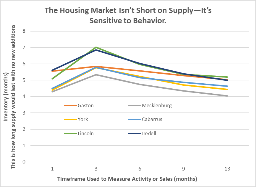
Months Supply of Inventory across six Charlotte-region counties, measured using 1, 3, 6, 9, and 13-month sales history lookback windows for general market insight — Q1 2026.
What this reveals is not a forecast. This analysis was not built to predict market direction. It was built to answer a more honest question: does the story change depending on how you measure it?
The answer, across all six counties, is yes — sometimes dramatically. And that gap between what the data shows at one measurement window versus another is where market personality reveals itself.
That distinction is at the heart of the Acre X Market Behavior Analysis.
The Measurement Problem No One Is Talking About
There is no industry-wide standard for how Months Supply of Inventory should be calculated. The Real Estate Center at Texas A&M University uses a 12-month average. Most MLS platforms default to 3 months. The U.S. Census Bureau and Federal Reserve use the current month's sales pace only. Each produces a different number from the same market — and none is universally recognized as the definitive method.
The 6-month balanced market benchmark faces similar scrutiny. Virginia Realtors published research questioning whether that threshold still reflects a healthy market. National data shows the market has not sustained 6 months of supply since February 2012 — yet markets continued to function throughout that period.
There is also a known flaw in what gets counted. The standard calculation treats every active listing equally — a home sitting unsold for nine months carries the same weight as one listed last week. Major consumer-facing platforms publish months of supply figures without disclosing their calculation methodology — no lookback window, no weighting approach, no seasonal adjustment explanation. Millions of buyers, sellers, and practitioners make decisions based on those numbers without knowing how they were derived.
New home inventory compounds this further. The months of supply figure for newly built homes includes not just homes completed and ready to occupy, but homes currently under construction and homes that have not yet broken ground. As of May 2024, the National Association of Home Builders noted that only 21% of new home inventory consisted of standing, completed homes. A market that appears oversupplied on paper may in fact have very limited immediately available inventory for a buyer ready to close today.
This is a call for more rigorous research. Universities with real estate programs — particularly those with access to longitudinal MLS data — are well positioned to examine what lookback window most accurately predicts price movement, whether the 6-month benchmark has shifted, and how new home inventory should be segmented. These are answerable questions. They deserve academic attention.
Until then, understanding how inventory is measured — not just what it shows — remains one of the most underappreciated skills in real estate analysis. The Acre X Market Behavior Analysis is built on that premise.
The Four Measurement Challenges — and How This Analysis Navigates Them
The measurement problems identified above fall into four distinct categories. Understanding them separately makes it easier to see both where the industry falls short and how a relational approach can navigate the limitations more honestly than a single static reading.
Challenge 1 — Methodological inconsistency
There is no standard lookback window for calculating MSI. The same market produces a different number depending on whether you use 1 month, 3 months, or 12 months of sales history. The number itself is not wrong — but without knowing how it was derived, it cannot be reliably compared, cited, or acted upon.
Challenge 2 — Benchmark validity
The 6-month balanced market threshold has not been meaningfully reassessed in a generation. Markets have functioned — pricing, transacting, and absorbing demand — well below that threshold for over a decade. Whether 6 months still defines balance, or whether the benchmark has shifted, remains an open and largely unexamined question.
Challenge 3 — What gets counted
The standard calculation treats every active listing equally. Stale inventory, resistant sellers, and non-completed new homes are counted the same as fresh, competitively priced listings. The result can inflate the supply number in ways that mask the true competitive environment — particularly in softening markets.
Challenge 4 — Transparency
Major platforms publish MSI figures without disclosing their methodology. No lookback window. No weighting explanation. No seasonal adjustment. Practitioners and clients are making decisions based on numbers they cannot evaluate.
We have called for university research programs to address these challenges at the standards level — establishing clearer methodology, reassessing benchmarks, and bringing transparency to how this metric is calculated and reported. That work is needed and overdue.
In the meantime, the Acre X Market Behavior Analysis is designed to navigate these limitations rather than ignore them. It does not claim to solve the measurement problem. It claims to work more honestly within it.
On methodological inconsistency — Rather than picking one lookback window and defending it, this analysis presents five simultaneously. The reader sees the full range of what the MSI could be across 1, 3, 6, 9, and 13 months of sales history. Instead of a single number of uncertain origin, you get a relational picture — a curve that shows how sensitive the market is to the window you choose.
On benchmark validity — When you can see a county's MSI across five timeframes, the 6-month threshold becomes less decisive. You are no longer asking "is this market above or below 6?" You are asking "how does this market behave across conditions?" That is a more useful question regardless of where the benchmark sits.
On what gets counted — Longer lookback windows naturally reduce the distortion caused by resistant sellers and stale listings. A 13-month sales average absorbs those periods of reduced activity into a broader trend. The multi-window approach does not eliminate the stale listing problem — but by showing both short and long windows simultaneously, it reveals where that distortion is likely occurring. A market whose MSI spikes sharply at 1 or 3 months but compresses significantly at 9 and 13 months is signaling that something short-term is inflating the near-term reading. That is information a single static number cannot provide.
On transparency — This analysis discloses its methodology explicitly. The data source, the lookback windows, the counties covered, and the measurement approach are all stated. That is the standard this analysis holds itself to — and the standard we believe the industry should adopt more broadly.
The shift from static to relational is the core of what this analysis offers. A static MSI reading tells you where a market appears to be at a moment in time, through one measurement lens, with unknown methodology. A relational reading tells you how a market behaves across conditions — how sensitive it is to the window you choose, how consistent it has been over time, and what that consistency or volatility signals for commercial decision-making. That is not a solution to the measurement problem. It is a more honest way to navigate it — until better standards exist.
County Case Studies — Acre X Market Behavior Analysis

Six-county Charlotte region — Months Supply of Inventory (6M stabilized condition), Q1 2026. Darker blue indicates tighter inventory. Data: Acre X Partners / ArcGIS Online / Canopy MLS.
Gaston County — The Paradox of Proximity
Gaston County should not behave the way it does. It sits directly adjacent to Charlotte. It has I-85 — arguably one of the most commercially significant corridors in the Southeast. It borders the River District, one of the most ambitious mixed-use developments in the region. It is minutes from Charlotte Douglas International Airport — the sixth busiest airport in the world for aircraft operations and a major logistics gateway for the Carolinas.
By every infrastructure measure, Gaston should move like an urban-adjacent market responding aggressively to Charlotte's growth. But the data tells a different story; the data is disclosing county personality.
Under the Acre X Market Behavior Analysis, Gaston's inventory curve is notably flat — the most stable of all six counties across every measurement window. As buyer and seller activity is measured across 1, 3, 6, 9, and 13 months of history, Gaston barely moves. It doesn't spike. It doesn't compress. It holds. In a landscape where the choice of measurement window can swing a county's MSI by a full month or more, Gaston's consistency is itself a signal worth noting.
That stability is not a flaw. It reflects a market that is less reactive to demand fluctuations — more predictable, more consistent, and more insulated from volatility. For commercial underwriting, that is a genuine advantage.
But the paradox remains. A market this well-connected — with this level of infrastructure access — that still moves slowly suggests something beyond economics is at play. Markets don't just respond to roads and runways. They respond to how people feel about change. Gaston may have the infrastructure of an emerging market but the temperament of an established one. That gap between access and acceleration is worth watching — because when it closes, it can close fast.
Mecklenburg County — The Benchmark
If Gaston is the paradox, Mecklenburg is the proof of concept. Mecklenburg opens among the pack at the 1-month timeframe — in fact the tightest of all six counties — and as the measurement window extends, something distinct happens. Mecklenburg's curve drops faster and further than any other county, landing at 4.0 months supply by the 13-month timeframe.
That downward slope tells an important story about both behavior and measurement. As the lookback window extends from 1 month to 13 months, Mecklenburg's longer-term sales history is stronger than its most recent month. The market earns its position the longer you look at it — the kind of signal that a single-window MSI reading cannot reveal.
Under the Acre X Market Behavior Analysis, this is what high-functioning market behavior looks like. It is not about having the lowest inventory at any single point in time. It is about how the market resolves the tension between supply and demand across different conditions and timeframes — and what that resolution looks like when measured honestly.
The question for operators is not whether Mecklenburg performs — it's whether the pricing that benchmark performance commands still meets ROI criteria.
York & Cabarrus Counties — Controlled Growth on Opposite Ends
York and Cabarrus Counties sit on opposite sides of Charlotte — York to the southwest across the South Carolina state line, Cabarrus to the northeast anchored by Concord. Despite their geographic separation, their inventory curves track closely together throughout every measurement window.
That alignment is not coincidental — and it is not a measurement artifact. It holds whether you look at one month of sales history or thirteen. The consistency of that pattern across timeframes gives it credibility. These two markets are genuinely behaving similarly, not just appearing similar because of how the data is sliced.
York carries a structural advantage in the South Carolina tax environment. Cabarrus counters with the Concord corridor, proximity to the speedway district, a growing secondary airport, and a residential pipeline that has remained active through multiple market cycles. Both markets demonstrate responsive but controlled behavior — reacting to demand shifts more noticeably than Gaston, but without the sharp swings that characterize markets still finding their footing.
Lincoln & Iredell Counties — Early Cycle, High Sensitivity
Lincoln and Iredell Counties tell the most dynamic story in this dataset — and the most measurement-sensitive one. Lincoln peaks highest of all six counties at the 3-month measurement window — reaching 7.02 months of inventory — before declining sharply as the lookback window extends. Iredell opens as the highest county at the 1-month mark and also peaks significantly before converging with the regional group by month 13.
That peak at the 3-month window is a meaningful signal. It suggests that sales activity slowed noticeably in the most recent 1-3 months — making short-term inventory appear elevated relative to the longer-term trend. A practitioner relying on a single MSI reading — particularly a short-window one — could draw very different conclusions than one who tests across multiple timeframes. That is precisely why measurement methodology matters.
Iredell sits firmly on I-77 — one of the most active growth corridors connecting Charlotte to the Lake Norman market and beyond. Lincoln, positioned between I-85 and I-77, draws from both corridors without being defined by either. Under the Acre X Market Behavior Analysis, that peak-and-compress pattern suggests these markets are more sensitive to short-term shifts in buyer and seller behavior — and more sensitive to how that behavior is measured.
Lincoln and Iredell are not markets to avoid. They are markets to understand — and to time.
Why This Matters for Commercial Real Estate
For commercial real estate professionals — whether advising tenants, investors, buyers, or sellers — this is not residential noise. This is signal. But the way that signal translates depends on the asset — and on how carefully the underlying data is interpreted.
In population-driven sectors like retail and mixed-use, understanding the rate at which retail demand may soften or strengthen becomes critical — impacting site viability, tenant performance, and lease-up timelines. A single inventory reading that hasn't been tested across measurement windows can produce overconfident assumptions in either direction.
In basic employment-driven sectors like industrial, these signals are secondary — but still directionally relevant when aligned with job growth, logistics demand, and infrastructure investment. Residential absorption patterns in surrounding counties can signal workforce availability and population density shifts that directly affect industrial site selection, labor access, and long-term demand for distribution and manufacturing space.
For office, the connection is real but more indirect. Residential growth signals population inflow and potential workforce expansion — but office demand today is shaped as much by remote work patterns, business formation rates, and employer footprint decisions as it is by where people live. Large corporate relocations and foreign direct investment operate on their own trajectory entirely — SMBC Group, one of Japan's largest financial institutions, recently announced a new Charlotte office bringing 2,000 jobs and $50.5 million in investment, a decision driven by Charlotte's position as the leading financial hub of the South, not by residential absorption data. That said, counties showing sustained residential absorption over multiple measurement windows are demonstrating the kind of population stability that supports organic office demand — particularly for professional services, healthcare, and local-market-facing businesses that follow rooftops rather than lead them.
For landowners and developers, land decisions — whether to hold, sell, entitle, or phase development — are based on expectations of future demand. Which means land supply, like inventory, is not static. It is the result of how market participants interpret and act on changing conditions over time — and how accurately they are measuring those conditions in the first place.
The Strategic Takeaway
Every market has a personality — and in this case, a county personality. The closer you get to a specific locale, the more insight can be gained on that personality.
- Gaston — model for stability, consistent across every measurement window
- Mecklenburg — the benchmark, earning its position the longer you look
- York & Cabarrus — controlled growth, aligned across timeframes in a way that gives their signal credibility
- Lincoln & Iredell — early cycle opportunity, with sensitivity to both market conditions and measurement approach
But the deeper takeaway is not about any single county. It is about how you read markets.
When you rely on a single static inventory number — derived from an undisclosed methodology, measured against a benchmark that hasn't been reassessed in a generation, do you still believe you are making the best decision?
The six counties in this analysis each behave differently. Some are stable and predictable. Others are reactive and sensitive to change. Some look dramatically different depending on which measurement window you use. That variation is not noise — it is signal. And it only becomes visible when you test the number across multiple timeframes rather than accepting a single reading at face value.
For commercial operators — whether underwriting a retail site, evaluating industrial demand, assessing office positioning, or timing a land decision — the question is not just what does the inventory say. It is how was it measured, what does the trend reveal, and how does this market behave when conditions shift.
That is the Acre X Market Behavior Analysis standard. The industry will get there eventually — the question is whether you wait for it or help lead the way.
Final Thought
Inventory alone doesn't tell the story.
Behavior does — and so does how you measure it.
If you miss that, you may be flying blind.
But when you understand both, you're no longer reacting to the market.
You're positioning for it.
Sources & References
- Real Estate Center at Texas A&M University — "Months of Inventory," explaining 12-month average sales denominator methodology. Published 2012, accessed April 2026.
trerc.tamu.edu - Virginia Realtors — "Is Five Months of Supply Really the Sign of a Healthy Housing Market?" Published April 14, 2022.
virginiarealtors.org - U.S. Census Bureau & Federal Reserve Bank of St. Louis (FRED) — Monthly Supply of New Houses in the United States (MSACSR). Continuously updated; accessed April 2026.
fred.stlouisfed.org - National Association of Home Builders (NAHB) — "High New Home Inventory: What It Means for Home Building." Published July 2, 2024.
nahb.org - Harvard Joint Center for Housing Studies — "With Existing Inventories Historically Low, Homebuyers Turn to the New Home Market." Published August 2023.
jchs.harvard.edu - Rocket Mortgage — "Low Housing Inventory: How It Affects the Real Estate Market." Updated November 15, 2025.
rocketmortgage.com/learn/low-housing-inventory - Worthington Realty — "What Is Months of Supply in Real Estate and Why Does It Matter?" Research on stale listing limitations and Competitive Inventory methodology. Published March 2025, accessed April 2026.
worthingtonrealty.com